Like so many people during the spring of 2020, Justin Miskowski and James Runkle were tasked with shifting their businesses to thrive in our new stay-at-home reality. As they juggled new demands from their homes, they also wanted to support the Hoboken community that gave them both so much, and they wanted to do it in a way that felt true to their talents and interests.
Though not on the front lines, Justin (Owner and Creative Director of Miskowski Design (aka Hoboken Made) sought a way to put his creative skills to work, and started sketching. What resulted was the symbol that he felt could be used show his support for healthcare and essential workers, local businesses and his community and is now known throughout Hoboken.
Enter, James. James (Owner of Drummond St. Strategy) has lived in Hoboken for twenty years. As life became more restrictive in Hoboken, he saw his fellow small businesses start to close their doors, both physically and digitally. He did what he could to help the community: ordering takeout from local favorites like Leo’s Grandevous, Dark Side of the Moo and Barbés…or contributing to the Hoboken Homeless Shelter and Hoboken Food Pantry.
But even “doing what he could” didn’t feel like enough, until James and Justin had the conversation that evolved into the project that became known as Heal Hoboken.
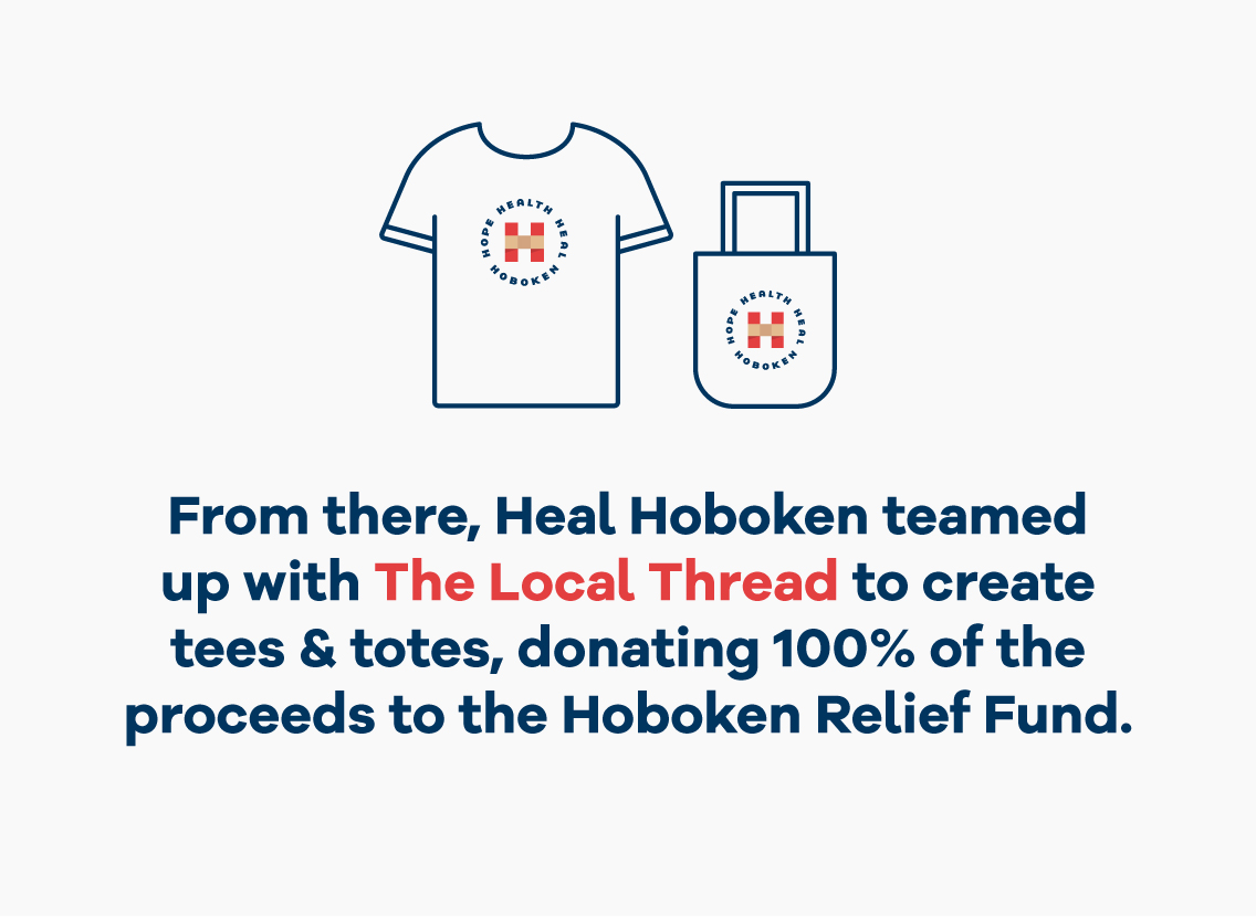
As the crisis has continued, more and more local companies have joined the effort to help Hoboken residents, restaurants and other small businesses and organizations stay afloat by staying safe as we head into winter. This broad support has led Heal Hoboken to change its name to the Heal Hoboken Collective to reflect the wide-ranging community support from businesses that are finding ways to pitch in with supplies and a healthy helping of optimism and good cheer. We have even opened a local storefront at 86 River Street where you can pick up supplies such as masks, sanitizers, floor decals and Heal Hoboken gear to show your support around town!
See our list of local partners here and join us as we continue to work toward healing Hoboken and keeping it strong for the future.
About the logo
(an interview with Justin Miskowski, Owner & Creative Director):
I wanted to do my part as a designer…. as small as that may be. At times of crisis, design can be used for a greater purpose. It can be powerful, moving and an extremely effective tool in providing unity, solidarity and hope to those who need it most. This symbol was born out of the urge to do my part and I made it for those who need it, much more than I do right now.
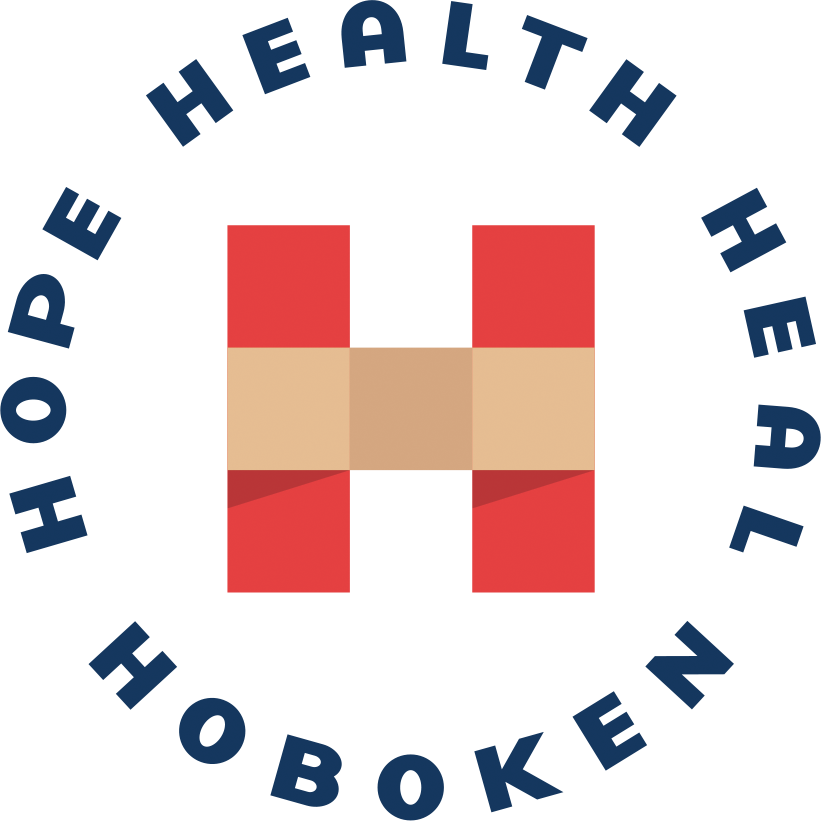
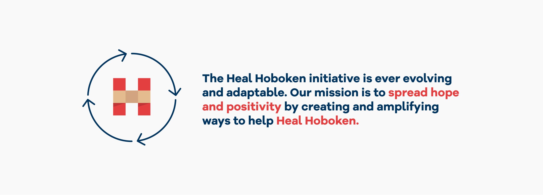
At first I was trying to do a Double H monogram (Heal Hoboken) – in doing so, I noticed the center was creating a medical cross. I liked the aspect of the cross to honor and symbolize our healthcare workers, but that wasn’t enough; I was missing the aspect of healing. When developing a logo, you want to pack as much as you can into the simplest form it allows. I thought a bandaid would be the best symbolic representation of healing. So I tried using that to represent the crossbar of the H. In addition to the symbolism of healing, the bandaid created a bridge between the 2 sides of the H, in a sense creating the feeling of unity and togetherness. Without this link, the H is not complete and the two sides become independent of one another. The idea of these 2 pieces relying on that bridge felt significant and really symbolized the idea that we rely on each other in times of crisis. Without banding together, we will fall apart. Without the bandaid, the 2 pieces would not be stable enough to stand on their own.
The message that surrounds and encapsulates the H icon is set in a circle, as a symbol of unity, wholeness and inclusion.
H = Hoboken, Hope, Health, Healing, Honor, Hospital, Healthcare, Heroes
Cross = First Aid, Medical Workers
The Color Red = Urgency, Energy, Alerts us, calls us to action, and motivates us.
Band Aid = Healing, banding together to help one another
With the use of 7 squares and a few colors, I was able to achieve a simple mark that is packed with symbolism and meaning.
